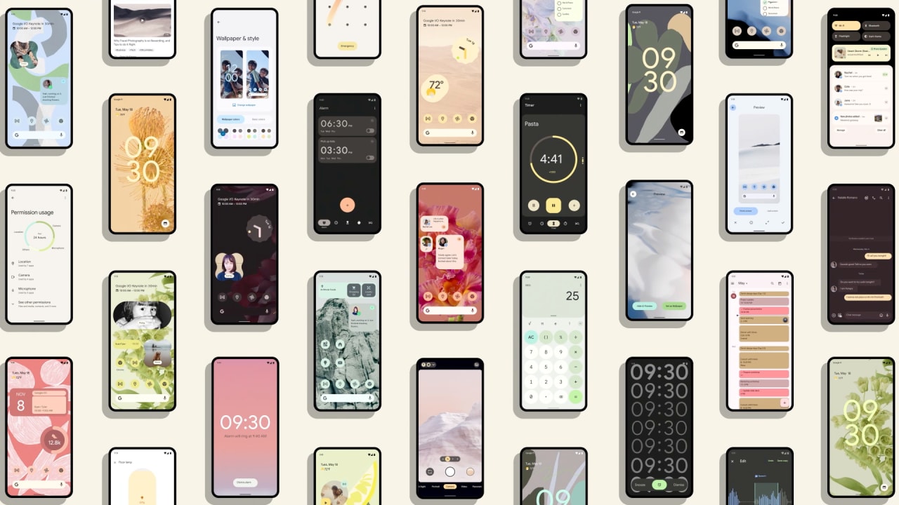
With a personalized color scheme on the outside and a reinforced app-privacy structure on the inside, the next version of Android should at least avoid a common fate of some previous Android updates: being mistaken for one of its predecessors. Android 12 , previewed in detail on Tuesday at Google’s I/O developer conference, leads off with those changes to form and function. But the next edition of its mobile operating system bundles many less obvious—but still notable—changes, including some that didn’t get mentioned during the two-hour keynote that opened the online event. Material You While many operating systems have offered personalization features, Google’s concept aims to make customization an automatic feature, not a distraction for interface nerds. Android 12 will derive highlight and contrast colors for its interface by analyzing your screen wallpaper. If your own screen decor already matches the current Android palette, you should still notice how many onscreen elements will be less rectilinear. For example, Google has already advised developers of onscreen widgets to get ready for rounded corners . [Photo: courtesy of Google] New visual effects will extend to animations to convey more clearly what’s going on. For instance, scrolling to the end of an onscreen list will cause it to stretch up and down the screen, and pressing the power button to wake the screen will send light rippling across the display. Quick Settings The set of toggles for such functions as airplane mode (remember that?) that you can invoke by swiping deeply down from the top of the screen should look a lot different in Android 12. The tiles you see today will be replaced by larger panes that show more detail about the state of each function. Android 12’s Quick Settings will also fold in new features.

Read more here:
Here’s what’s new in Android 12, from big changes to subtle tweaks